An article on La Presse (in french) reports on a study during which researchers asked participants to place Ukraine on a map. If you don’t read french it’s ok, just look at this picture.
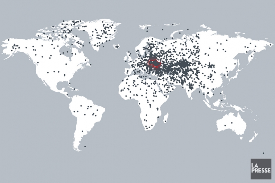 The original picture looks like this. My first thought, when looking at this image, is “What’s so bizarre in Eurasia that one just stops clicking right of India?” If you don’t see it, look at this updated version with a line, below.
Let’s do a little detective work. The original image size is 1540 pixels wide by 1025 pixels high, or an aspect ratio of roughly 1.5. That corresponds to an aspect ratio of 4.5:3, 13.5:9, or 15:10. None of which sound familiar. My red line is about 1120 pixels from the left edge. 1120:1025 is really close to 1:1 (it’s 1.09:1). My guess is the map was shown within a square box, centered around Greenwich for longitude. There may have been 95 pixels cut from the left side (basically Alaska).
 The take home message is that such an error (if I’m right) would have been easily fixable. (I’m also trying to figure out which data was used to make the outline of the continents, but I can’t tell. Both google and openstreetmap show the great lakes at very low zoom settings.)
Recent Comments